
CASE STUDY
Outdoor Unidos

SUMMARY
Breaking down barriers to nature for immigrants and underrepresented groups through skill-based outdoor programming that builds confidence, connection, and a lifelong love for the outdoors.
The Problem
Outdoor Unidos was born out of a powerful collaboration between Colorado Mountain Club and Vive Wellness to address a critical gap in outdoor recreation: the lack of access and representation for immigrant and Latinx communities. Many of their participants—first-generation immigrants, youth, and families—had never seen themselves reflected in traditional outdoor spaces. They faced very real barriers: transportation, language, unfamiliarity with the land, and a quiet, persistent question—Do I belong here?
The program had just received grant funding to launch, and excitement was building fast. But with no brand identity, no logo, and no messaging system in place, they lacked the foundation to connect with participants, partners, and funders in a meaningful way. They had heart. They had purpose. But their brand wasn’t telling that story.
The Challenge
Time was tight. The team was just weeks away from launch and had already attempted to create a logo using AI tools—but the results felt generic and disconnected. What they needed wasn’t just a quick fix. They needed a brand that could communicate the depth of their mission, build trust with underrepresented communities, and carry their vision forward with clarity and confidence.
They were also trying to speak to two very different audiences: participants from immigrant communities and institutions like funders, partners, and grant reviewers. The brand had to walk a delicate line—bold and joyful, but professional. Culturally grounded, but adaptable. It had to feel like something people could belong to.
That’s when they reached out to me through Catchafire. What started as a logo request quickly turned into a full-scale creative partnership.
The Solution
I started by listening. Before designing anything, I built a brand strategy that clarified their mission, voice, and audience. That became the filter for every creative decision.
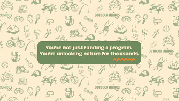
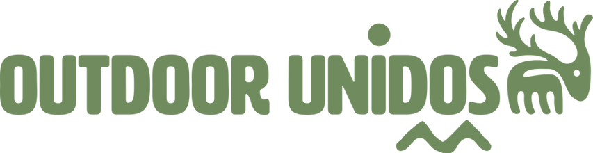
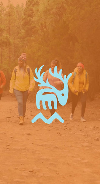
The identity needed to earn trust fast—so I designed a bold, culturally rooted system built around an elk mark that symbolized strength, unity, and movement. Inspired by Colorado’s landscape and Indigenous forms, it’s instantly recognizable and emotionally grounded.
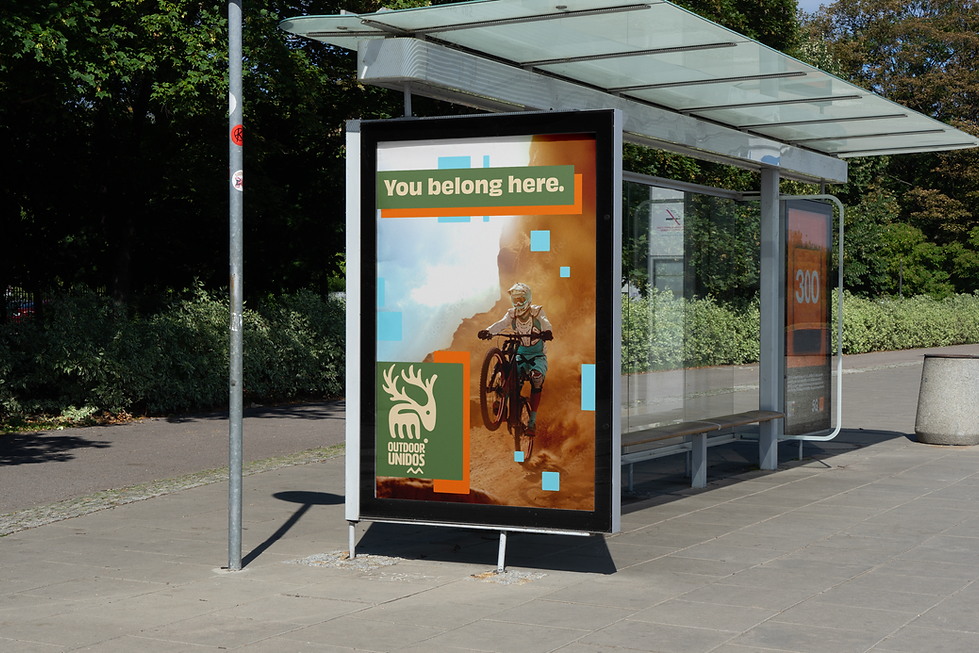
Every element—logo, typography, colors, merch, and deck—was created with one goal: to make people feel like they belonged before they ever showed up.
Category
Non-Profit, Community, Outdoor Education
Things I Did
Brand Strategy + Positioning
Visual Identity System
Logo Design & Animation
Messaging System
Merch Design
Brand Guidelines
Sponsorship Deck
Illustrations & Brand Pattern
Creative Direction
Ongoing Lead Design Support


"Ravit has a remarkable ability to translate abstract ideas into
powerful visual narratives."
"Ravit has a remarkable ability to translate abstract ideas into powerful visual narratives. As the branding wizard behind Outdoor Unidos, she took our scattered thoughts and transformed them into a cohesive visual strategy that perfectly captures our mission of inclusivity in the outdoors. Her thoughtful approach went beyond simple design work—she truly understood our values and created a brand identity that resonates authentically with our community. Working with Ravit wasn't just about getting great design; it was about having a creative partner who could see our vision, enhance it, and bring it to life with exceptional skill. If you're looking for a designer who blends strategic thinking with creative brilliance, Ravit at Stardust Designer is an outstanding choice."
— Graham Ottley, Director of Education
